The Data Project
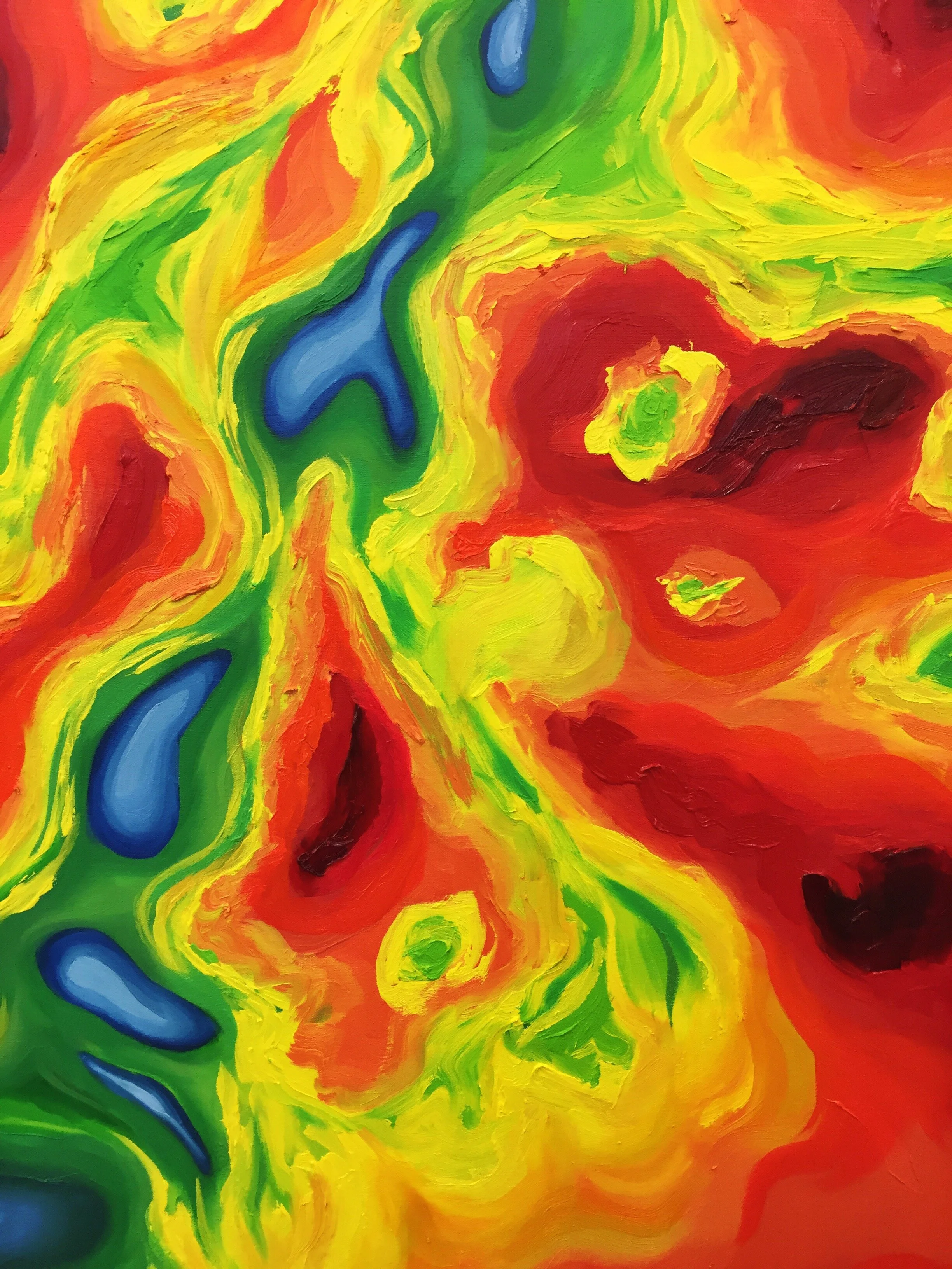
Working from a composed and cropped image of Arctic ice thickness data out of Los Alamos National Labs, which I color-encoded using one of environmental science's most popular (and ineffective) colormaps, this painting is the first in a series of data-driven, impressionist-style, impasto pieces. Standing at 5' x 7', the work's bodily size and gestural mark-making challenge the viewer to confront the work and what it stands for. I intend this series to ask questions about how we interact with screen-driven visuals, and how we respond differently to a work of great depth of color and complexity of form in the real world, whose composition references imagery increasingly familiar to us all. What does this colormap mean to us? What conclusions do we jump to about the content? How can our data be made more human, more visceral, more real?
Created over the course of one semester, Fall 2019.