Interdisciplinary approaches to
climate change visualization.
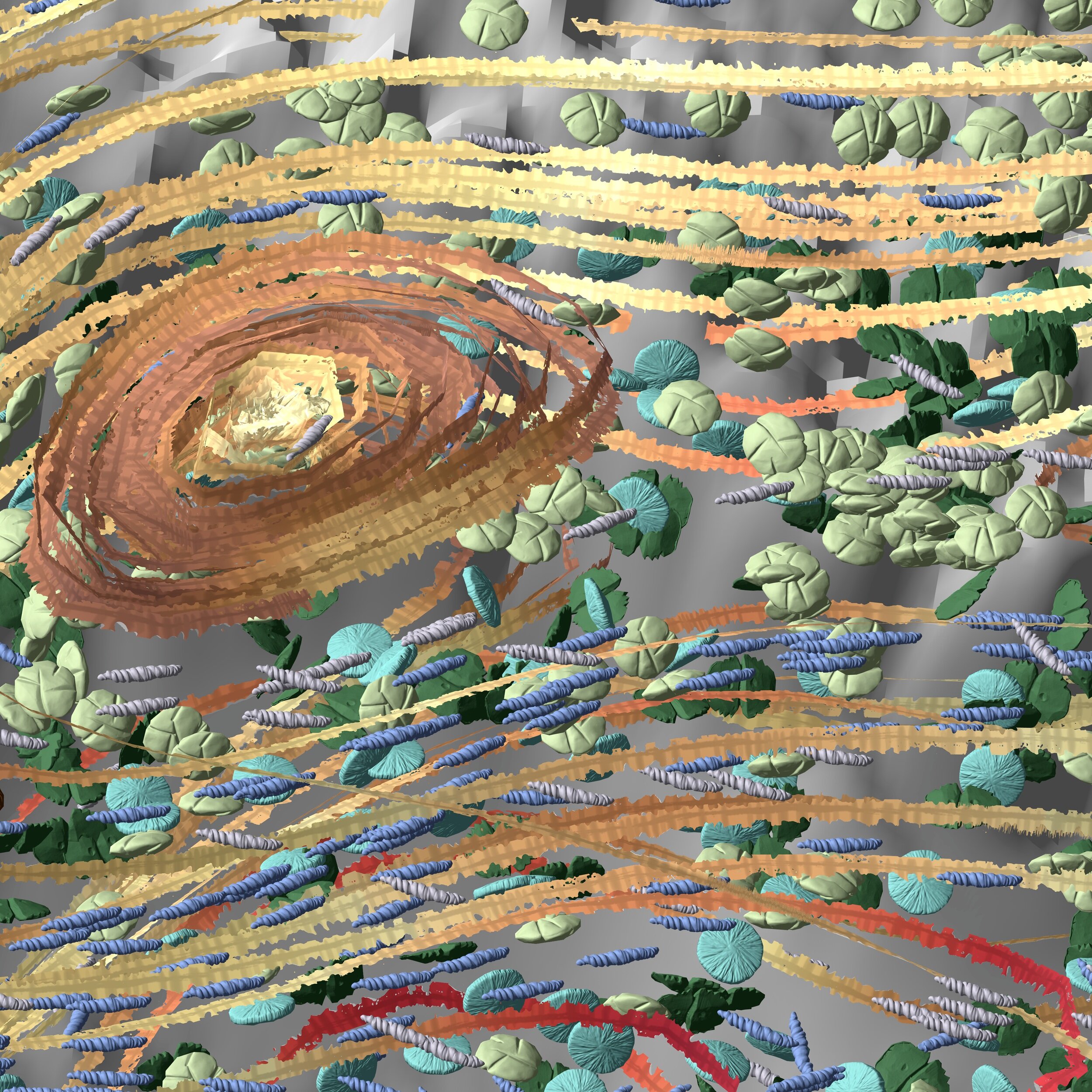
Visualization by Francesca Samsel.

Spatial Data Images are multivalent.
Geovisualization and digital cartography have always been essential to the geographic community. However, despite significant research examining the social, cultural, economic, and historical construction of maps and map-objects, comparatively little work has considered their specific aesthetic epistemologies, especially in relation to existing literature on their complex semiotics. This gap is apparent not only in the production of geovisualizations for research and analysis, but also in cartographic and spatial data products made for public consumption.
My work aims to explore this gap through both theoretical and practical means. This website includes a collection of past and ongoing research-related work, as well as art and any relevant non-academic writing.


Geography MA Thesis
Beyond Representation: Arts-Informed Visualization Praxis for Earth Systems Simulation Data

Featured Publications
Enabling Crosscutting Visualization for Geoscience
Visualization has the potential to support holistic cross-disciplinary analysis to understand the complex inner workings of our world, but doing so requires a paradigm shift to understand how visualization might enable lines of inquiry transcending traditional disciplinary boundaries. We present challenges for visualization in fostering such holistic geoscience analyses.
Environmental Visualization: Moving Beyond the Rainbows
Pseudo-coloring is a well-established, fundamental tool for visualizing scientific data. As the size and density of data grows, increasingly more discriminatory power is required to extract optimum feature resolution.
Printmaking, Puzzles, and Studio Closets: Using Artistic Metaphors to Reimagine the User Interface for Designing Immersive Visualizations
We, as a society, need artists to help us interpret and explain science, but what does an artist's studio look like when today's science is built upon the language of large, increasingly complex data? This paper presents a data visualization design interface that lifts the barriers for artists to engage with actively studied, 3D multivariate datasets.
Affective Palettes for Scientific Visualization: Grounding Environmental Data in the Natural World
We draw from both the natural world and artistic color theory to present 1) a new color system, designed to establish an affective connection between big environmental data and its original source material, 2) a tool for extracting these workable palettes from natural imagery, and 3) a selection of pre-made linear colormaps and discrete color sets drawn from natural environments.
Using Close Reading as a Method for Evaluating Visualizations
Visualization research and practice that incorporates the arts make claims to being more effective in connecting with users on a human level. However, these claims are difficult to measure quantitatively.
Visualizing Science: How Color Determines What We See
Color strongly influences the way we perceive information, especially when that information is dense, multidimensional, and nuanced—as is often the case in scientific data sets. Choosing colors to visually represent data can thus be hugely important in interpreting and presenting scientific results accurately and effectively.
Automatic Generation of Data Legends
We introduce a new style of automatic legend generation for 3D multivariate visualizations to accommodate artist introduced visual variation. The software Artifact Based Rendering created the ability for artists to design complex 3D data-driven visualizations.
The Future of Science Visualization is in the Arts
Engagement does not automatically beget profound, transcendent comprehension or connection. In fact, promoting art’s contributions to science as purely topical, like window dressing for the gargantuan structure that is exhaustive empirical research, is not only harmful to our perception of these cultural necessities—it’s insulting to the vigor of those fields and limiting to those who wish to contribute more concretely.

Ongoing projects span
interactive
data physicalization,
aesthetics, and semiotics

AGU’s Eos, July 2020 Print + Online
Talks + Presentations
Toward an Improved Colormapping Workflow: New Task-Driven Tools and Techniques for High-Level Colormapping Applications in Scientific Visualization
Color, a nearly ubiquitous encoder for scientific visualizations across disciplines with robust range and versatility, often remains constrained to narrow hue, luminance, and saturation ranges within the scientific community. Despite significant work in perceptual literature on more effective uses of colormapping, difficulties persist in bridging research and practice.
The Shared Public Space: A Proposed Framework for Improved Climate Communication through Cross-Disciplinary Approaches
If effective communication of complex concepts is no longer defined merely by mutual understanding, but also through mutual response, how must we accordingly shape earth science communication for a century enduring compounding crises? Here I propose a framework for forward-looking climate communication based in the emerging discipline of data physicalization and drawing on expertise from the tradition of sculpture and exhibition in the fine arts and place-based meaning-making in architecture.
Improving the Science Communication Pipeline: A Proposed Framework for Increasing Accessibility and Engagement for Large, Multivariate and Dynamic Data thru Intuitive Visualization Methods and Color Theory Application
Dating from the Renaissance, a tradition of dividing disciplines of study along the lines of the technical and the abstract has prevailed as the most practical approach to specialization. However, this divide in recent decades has proved detrimental in effective dissemination and comprehension of research, especially in the case of large, multivariate data sets necessitating complex visualizations.
Press + Media
“To model carbon flow in the ocean, Riley Brady and Stephanie Zeller killed rainbows and discovered garbage. To be more precise, they knew that the bright RGB band of color used by scientists to represent data since time immemorial was useless to explain three-dimensional carbon distribution in the Southern Ocean, so it became crucial to implement fresh color maps and video storytelling, even if they wound up modeling the Pacific Garbage Patch by accident (see cover image and Figures 1,2, and 3).”
“Powerful visuals can often evoke excitement and emotion, driving a deeper level of engagement with the audience and subject matter being presented. The AGU Michael H. Freilich Student Visualization Competition Program provides an opportunity for students to demonstrate creative ways to use visualization to present complex problems in the Earth and space sciences as well as transdisciplinary sciences.”